Client: GIOVANNI PINOSIO
Year: 2024
Giovanni Pinosio
digital visual identity
Giovanni Pinosio, a Venetian artist, wanted to renovate his digital image, creating a new website that could highlight his works, and display it consistently on social media through a visual system that could represent the artist's range of activities with versatility.
We therefore started with a minimal but at the same time personality-rich mood, in which the colour blue, dear to the artist, would be the guiding thread both in the navigation of the site and in the elements constituting the visual system for social media. In fact, the artist himself recounts his first approach to sculpture with these words:
‘I found a ball of blue wool and started to build a weft: I connected the thread to the window handle, then I climbed up a piece of furniture to reach a shelf, and from the shelf to the door, and from the door to the leg of the table... In the end, I filled the room with blue lines: my name is Giovanni, I am seven years old and when I grow up I want to be an artist.'
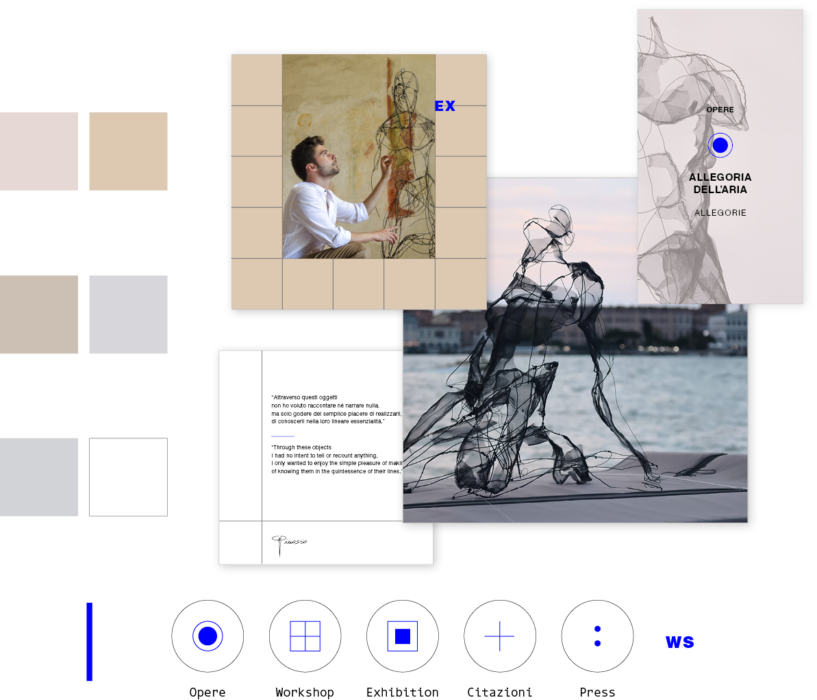
The blue thread therefore holds together forms and spaces, just like the iron wire that generates the artist's sculptures, in a fluid flow of navigation, in which the dynamic effects are delicate but at the same time incisive.
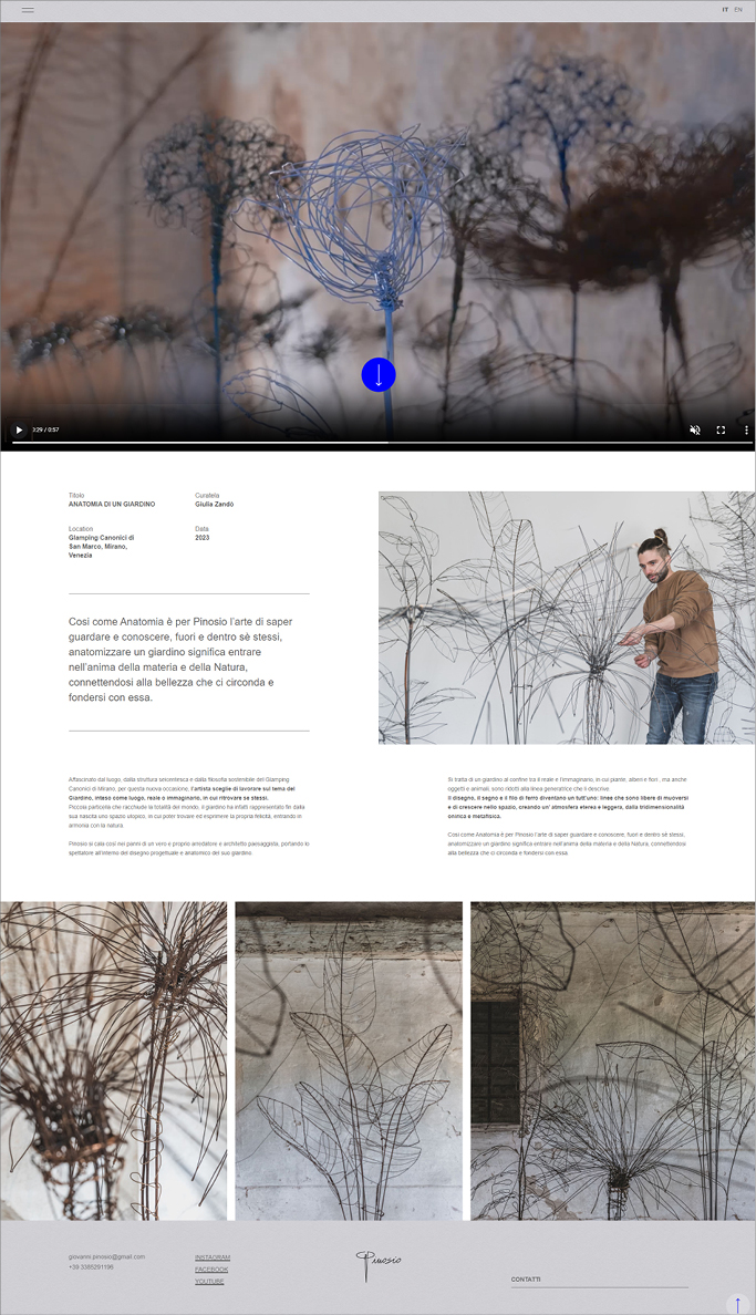
The photos of the works, which are clear, are counterbalanced by the images of the artist, which are charged and chiaroscuro.
In terms of usability, the contents are accessible from several levels through a few clicks, in a fluid and spontaneous navigation, but also in a more structured form through a megamenu.
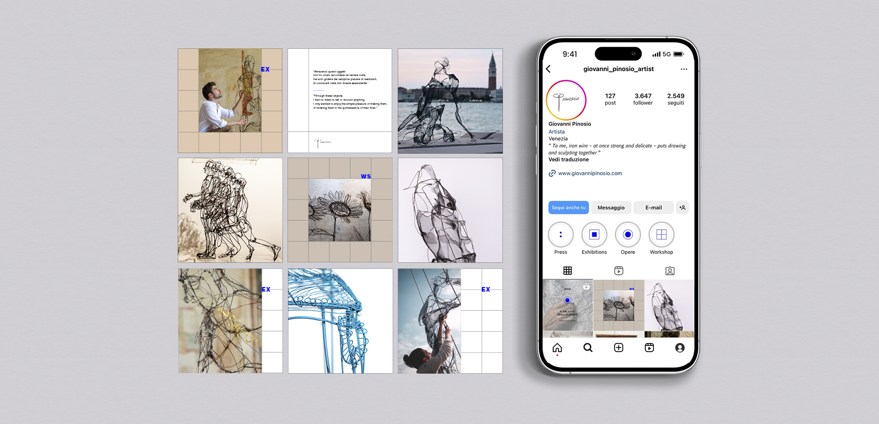
The visual system designed for the artist's social media has been developed consistently with the work done on the site.
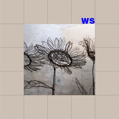
In this case, the multiplicity of the artist's activities is articulated through elements that manage to create a sense of uniformity and variation: symbols have been developed for each category of service, while the images alternate on a palette of neutral tints - intended to recall the tonal drawing paper - on which a modular grid is sometimes superimposed, which in turn is intended to recall the modularity of anatomical tables - the starting point for the artist's formation.
In this case, the multiplicity of the artist's activities is articulated through elements that manage to create a sense of uniformity and variation: symbols have been developed for each category of service, while the images alternate on a palette of neutral tints - intended to recall the tonal drawing paper - on which a modular grid is sometimes superimposed, which in turn is intended to recall the modularity of anatomical tables - the starting point for the artist's formation.
Finally, a variety of modalities were developed depending on the type of content: reels, carousels and stories thus share a coherent appearance, while at the same time diversifying from one another, so as to create a sense of clarity and order, always emphasising the works first and foremost.