01.09.2021 > news and events
Responsive vs Mobile First
NO, IT'S NOT JUST A MATTER
OF DESIGN!
TAGS: BRANDING /
GRAPHIC DESIGN /
COMPANY PROFILE
GRAPHIC DESIGN /
COMPANY PROFILE
Have you ever browsed a site from your smartphone and found yourself faced with text that was too small to be readable, or content that you can only half see, or having to scroll endlessly to find the main information?
Well, you have come across a site not designed for mobile use. This does not only happen to ‘home-made’ sites, but also to well-structured companies.
Well, you have come across a site not designed for mobile use. This does not only happen to ‘home-made’ sites, but also to well-structured companies.
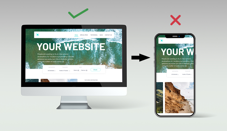
The focus on mobile use has now become a priority since the majority of overall web traffic takes place on mobile platforms. This means that optimising a site for mobile devices is no longer an option, but an obligation that benefits not only users - whose experience will be improved - but also search engine rankings.
In fact, graphics that are not well adapted to mobile use can result in difficult, frustrating or even completely unsatisfactory navigation experiences, leading users to search for the same products or services on pages that are easier to navigate (perhaps those of competitors). Moreover, Google's algorithm better positions sites that are designed from a perspective that puts mobile use at the centre.
Before delving into the advantages of the mobile-first approach, let's take a step back and understand where this tendency stems from.
The trend of designing sites from a mobile perspective is nothing new, but has been around for a few years now. What has changed, however, is the approach to design.
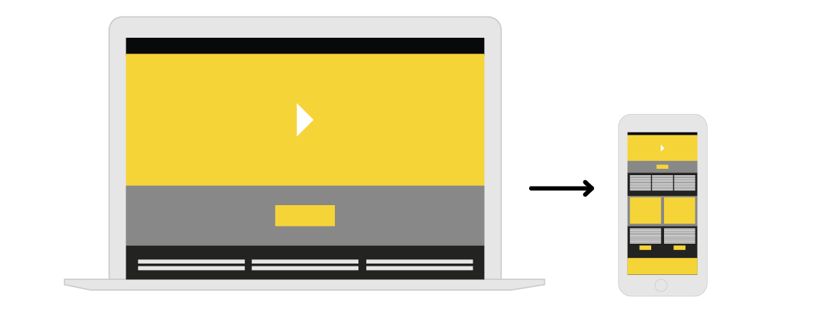
The first method developed was that of scalable design, which consists of designing the site in a desktop version, so that it could automatically fit the size of the screen on which it is being used. This approach works if certain limits are respected, sacrificing originality: layout with a single vertical grid, use of fairly large fonts, well emphasised call to action.
In fact, graphics that are not well adapted to mobile use can result in difficult, frustrating or even completely unsatisfactory navigation experiences, leading users to search for the same products or services on pages that are easier to navigate (perhaps those of competitors). Moreover, Google's algorithm better positions sites that are designed from a perspective that puts mobile use at the centre.
Before delving into the advantages of the mobile-first approach, let's take a step back and understand where this tendency stems from.
The trend of designing sites from a mobile perspective is nothing new, but has been around for a few years now. What has changed, however, is the approach to design.
The first method developed was that of scalable design, which consists of designing the site in a desktop version, so that it could automatically fit the size of the screen on which it is being used. This approach works if certain limits are respected, sacrificing originality: layout with a single vertical grid, use of fairly large fonts, well emphasised call to action.
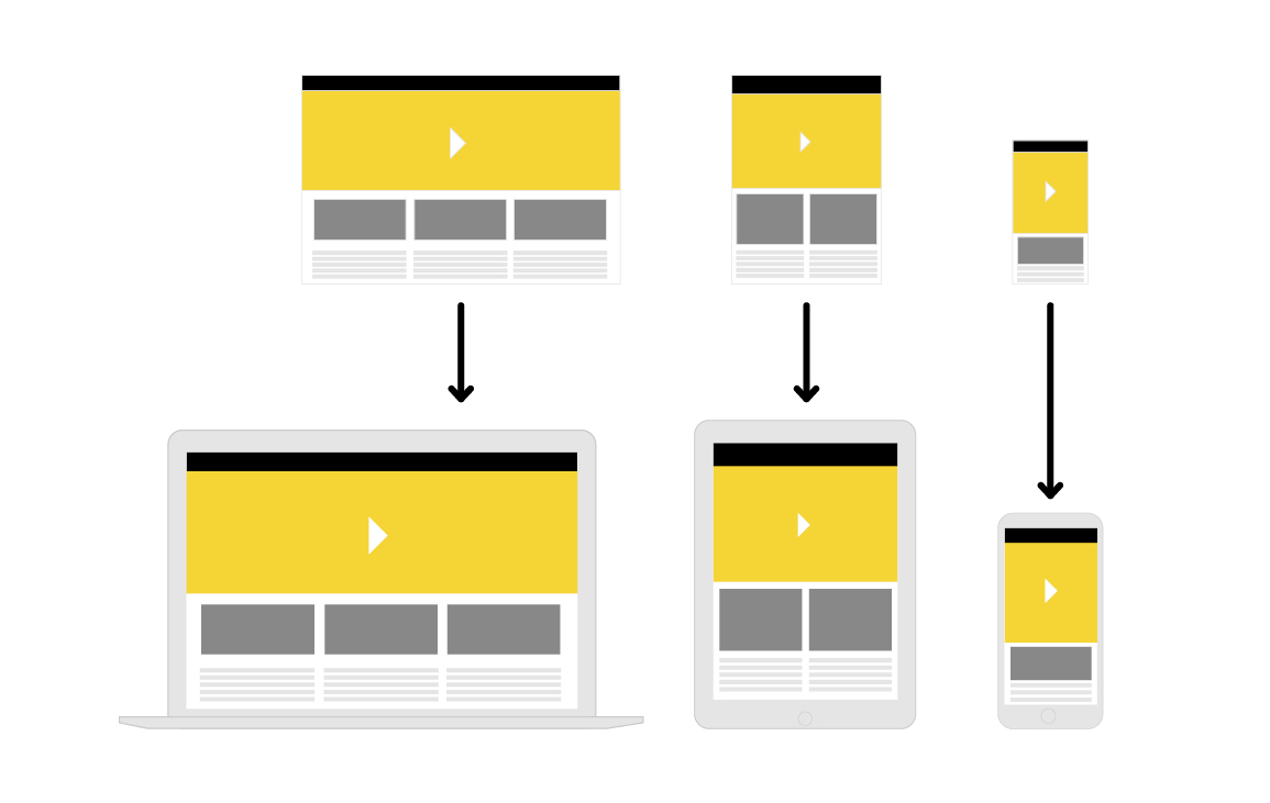
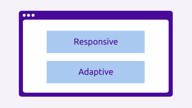
A step forward came with adaptive design, in which different layouts were designed for different screen resolutions. When a user opens a site, the browser defines resolution and aspect ratio as being the factors for loading the right layout for that specific device. This approach obviously entailed more work on the part of designers and developers, since the different layouts had to be created one by one.
The natural evolution of this ‘basic’ approach is responsive design, in which one begins with the desktop version of the site, taking advantage of a set of rules defined upstream that allow optimal adaptation for mobile devices: it is not the entire design that shrinks proportionally, but rules are inserted for the main components, e.g. ‘if the orientation of the smartphone screen changes from vertical to horizontal, adapt the images to fill the screen’.
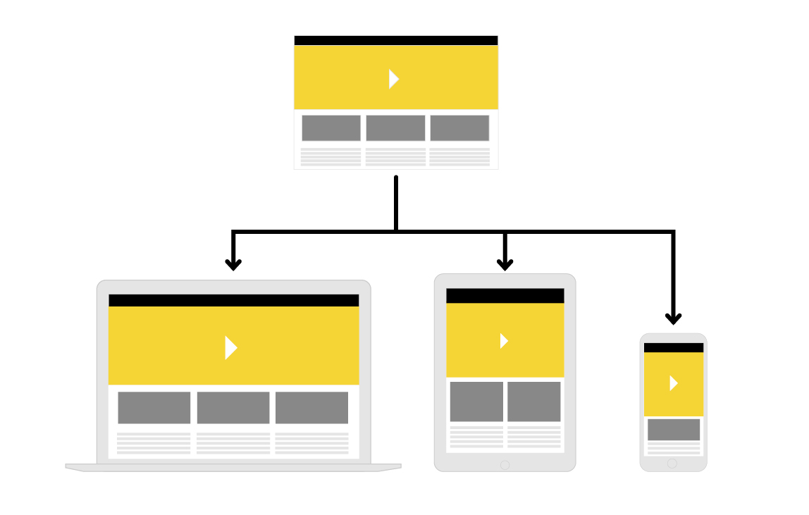
This methodology allows users to have an optimal user experience regardless of the device used, and designers to have better control over the final effect and greater design freedom.
From the point of view of the final effect, adaptive and responsive design are comparable: both adapt to different screen resolutions, but with adaptive design, a new page is loaded when the screen resolution changes, whereas with responsive design, the change is smooth, as it is based on the same layout.
From the point of view of the final effect, adaptive and responsive design are comparable: both adapt to different screen resolutions, but with adaptive design, a new page is loaded when the screen resolution changes, whereas with responsive design, the change is smooth, as it is based on the same layout.
* image source
In any case, both these methodologies reflect the originally desktop-centric evolution of the web.
The practice of designing sites primarily on desktop and then adapting them to mobile means that mobile versions often turn out to be the ‘ugly replicas’ of their desktop counterparts.
The practice of designing sites primarily on desktop and then adapting them to mobile means that mobile versions often turn out to be the ‘ugly replicas’ of their desktop counterparts.
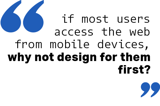
The ‘mobile first’ logic, on the other hand, starts from the assumption that if most users access the web from mobile devices, why not design for them first? Unlike the previous approaches, in this case the designer, when thinking about the website, starts from designing it on mobile, and then thinks about how to adapt it to desktop.
Prioritising mobile means not just adapting, but completely rethinking the content to be displayed, its structure and priority, given the limited space of mobile screens.
Prioritising mobile means not just adapting, but completely rethinking the content to be displayed, its structure and priority, given the limited space of mobile screens.
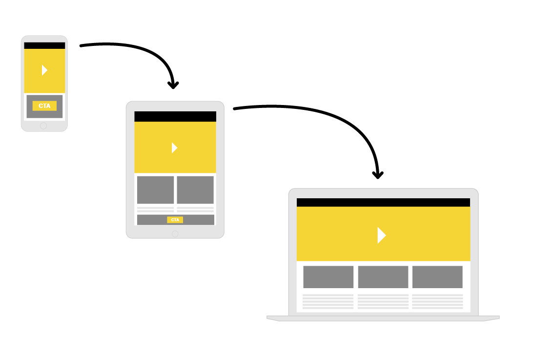
The design in other words has to take space limitations into account, removing or collapsing elements that are not strictly necessary (which can instead be retained in the desktop version). The needs of mobile and desktop users are in fact different: desktop users look for more detailed information, while mobile use requires quicker access to the main information and a clearer understanding of the actions to be performed.
However, the debate between the various approaches is not only a matter of design.
Mobile connections have increased significantly over the last 10 years compared to desktop connections; moreover, mobile design, with its essential content, enables faster loading of pages (a site that loads in 1 second has a 3 times higher conversion rate than a site that loads in 5 seconds).
But the most important aspect has to do with a better ranking on search engines. In fact, the results provided by Google are based on precise algorithms that have undergone radical changes in recent years: whereas some time ago responsive sites were favoured, now mobile-first sites are privileged.

* image source
Having said that, there are still niches, especially in the b2b sphere, where desktop fruition is still the one preferred by most users, and this must be taken into account when starting the strategic design of a website.
Discover our Web Design projects.
CONTACT US FOR MORE INFORMATION, TELL US ABOUT YOUR PROJECT AND LET'S BRAND TOGETHER!
Follow all Visualcom updates on our Diary, social media channels and subscribe to our newsletter.
Do you have questions related to communication or marketing that you would like us to answer?
Write us your doubts and we will answer them.