01.09.2021 > news and events
Designing a label
and why it's important
TAGS: BRANDING /
GRAPHIC DESIGN /
COMPANY PROFILE
GRAPHIC DESIGN /
COMPANY PROFILE
As for any other design project, the starting point should be a profound insight on the target and the competition. Who should buy my product and why, where can these people be found, what do they like and so on. On the other hand, what do my competitors' products look like that can be found in stores next to my product? And how can I make it stand out among them?
Once these questions are answered it is possible to plan a strategy for the approach and look of my packaging design. But is it really necessary to create an entire strategy for a label? Yes, because it can be a decisive factor in the moment of purchase for many buyers. Among lots of similar products that they will see on the shelves their first action will be taking and observing closely the ones they like the most. Even if they are looking for a product they already know and buy, there is more probability that they will try something new if we get their attention. So, first impression is important, just like in life.
Once these questions are answered it is possible to plan a strategy for the approach and look of my packaging design. But is it really necessary to create an entire strategy for a label? Yes, because it can be a decisive factor in the moment of purchase for many buyers. Among lots of similar products that they will see on the shelves their first action will be taking and observing closely the ones they like the most. Even if they are looking for a product they already know and buy, there is more probability that they will try something new if we get their attention. So, first impression is important, just like in life.
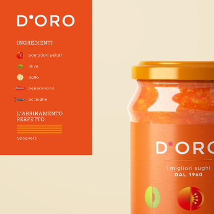
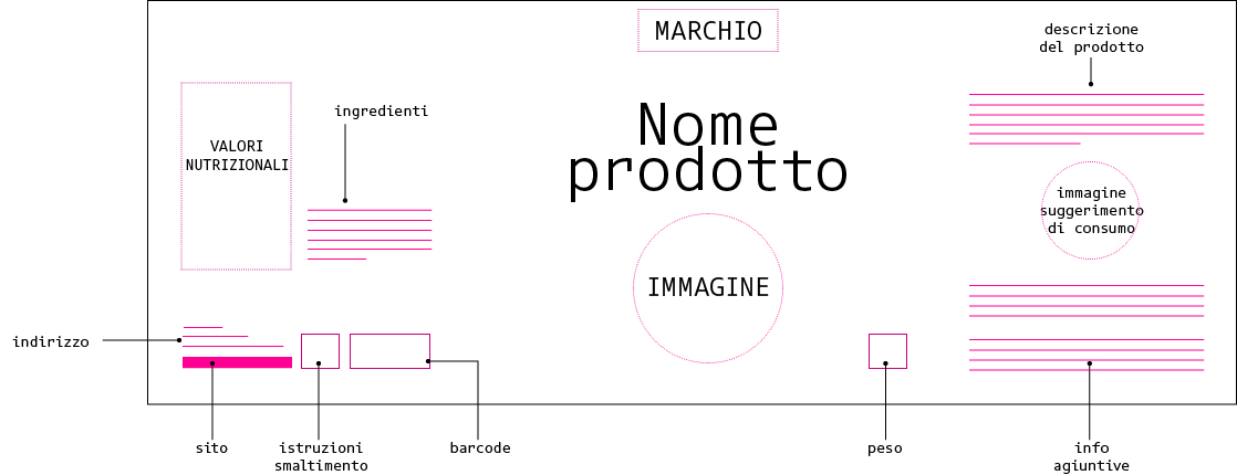
Depending on the type of product, there are different elements that the label design must contain. First of all, the main information such as the brand logo, the product name and a clear and concise description. Usually followed by information on usage, weight, ingredient list, expiring dates, certificates, codes, symbols, translations, manufacturer details, contact details etc. So, it can be very challenging creating a well-managed design, especially when we don’t have much space available. But with the right application of the visual hierarchy principles, it is possible to organize the layout well.
Other aspects to consider when designing a layout are surely the printing possibilities and limitations. For example, they may refer to the colors that can be achieved, the material on which the print must be applied or the product area where the label can be added. Let’s not forget the bleed areas necessary for printing. All of this can greatly influence the design, so it would be ideal having all of the above defined before starting the project.
Important information should never be placed too low on the product because we have to consider the height of front bars and signalization that can sometimes be found on shelves or displays, which can make the information less legible.
Important information should never be placed too low on the product because we have to consider the height of front bars and signalization that can sometimes be found on shelves or displays, which can make the information less legible.
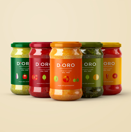
When it comes to visual elements, the choice of colors, fonts, decorative elements and the quantity of elements in general will make a difference. Stronger colors, more legible fonts and less busy designs will stand out more. It often happens that different brands use same or similar colors for products of the same type, and there is nothing strange about it because certain colors reflect the logic of the ingredients or use. When the case allows it, it would be preferable to consider the colors opposite to those found in most of the competing examples.
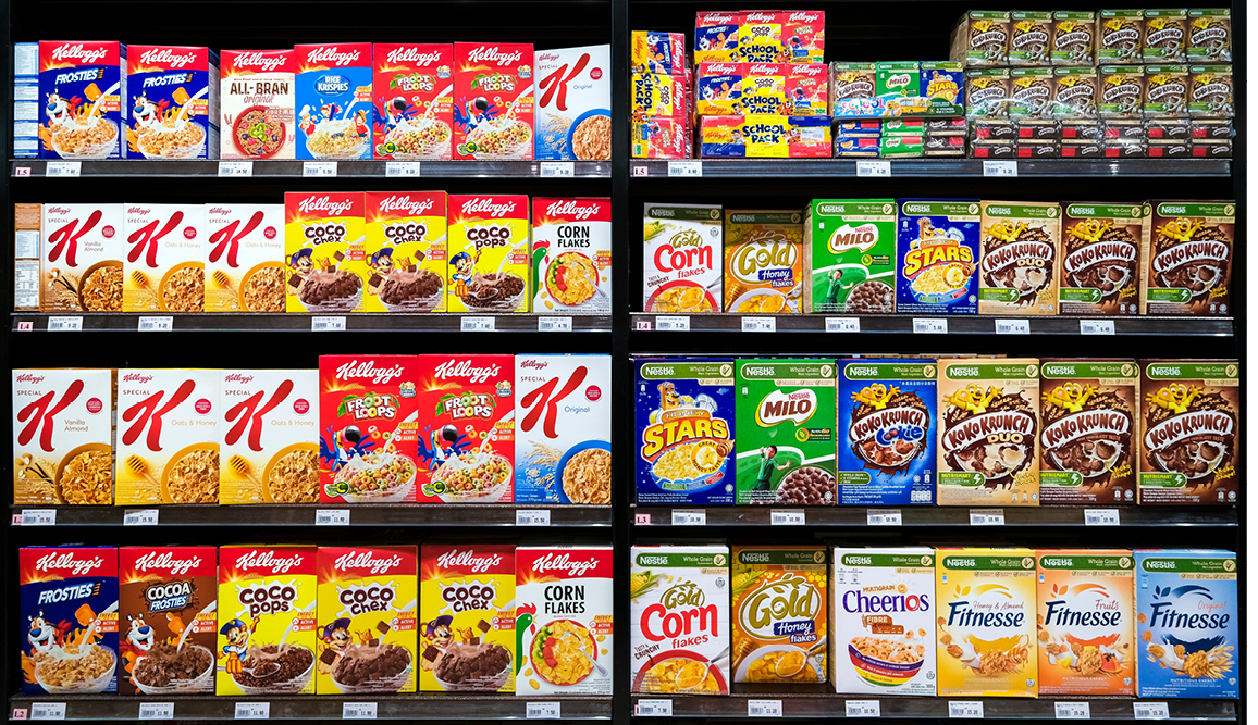
After the label is designed, it is important to do a photomontage by inserting it among the existing products on the shelves of different supermarkets. That way we will be able to evaluate the result and eventually make changes to improve its design and visibility.
After the label is designed, it is important to do a photomontage by inserting it among the existing products on the shelves of different supermarkets. That way we will be able to evaluate the result and eventually make changes to improve its design and visibility.
Follow all Visualcom updates on our Diary, on social channels and subscribe to our newsletter.
Do you have any question related to communication or marketing that you would like to answer? Write us your doubts and we will be happy to get back to you.