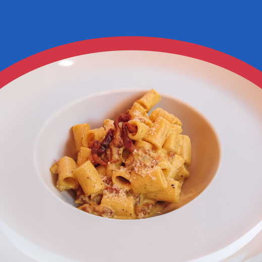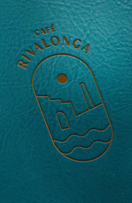
Il nuovo volto della pausa perfetta a Murano.
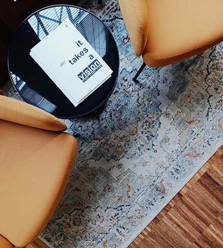
CI VUOLE STRATEGIA,
CREATIVITÀ E VISIONE
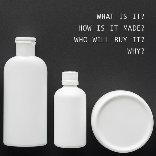
Siamo l’agenzia di comunicazione che ridefinisce il modo in cui le aziende si presentano, combinando ascolto, visione e cura del dettaglio.
Costruiamo identità, progettiamo interfacce e sviluppiamo comunicazione per aziende che vogliono essere capite, non solo essere viste. Mettiamo ordine dove c’è confusione e trasformiamo idee in sistemi che reggono nel tempo.
Siamo nati quasi quarant’anni fa e da allora abbiamo cambiato strumenti, linguaggi e formati più volte.
Quello che non è cambiato è il nostro modo di guardare i progetti: con metodo, senso critico e una creatività che serve a far funzionare le cose, non solo a renderle belle.
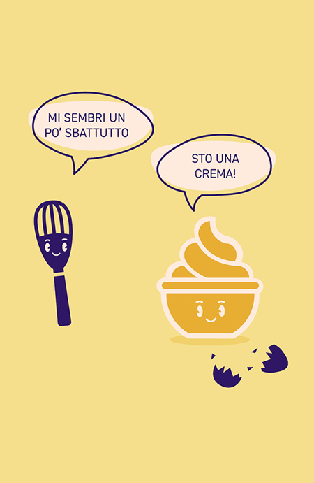
E sì, anche riconoscere quando un’idea è ancora cruda, o quando è pronta per essere servita, fa parte del lavoro.
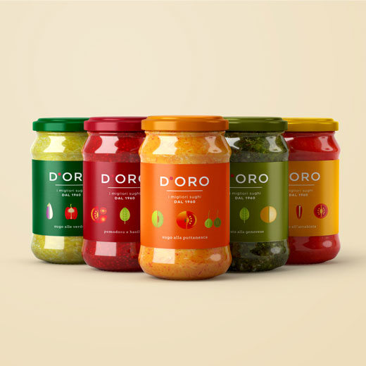
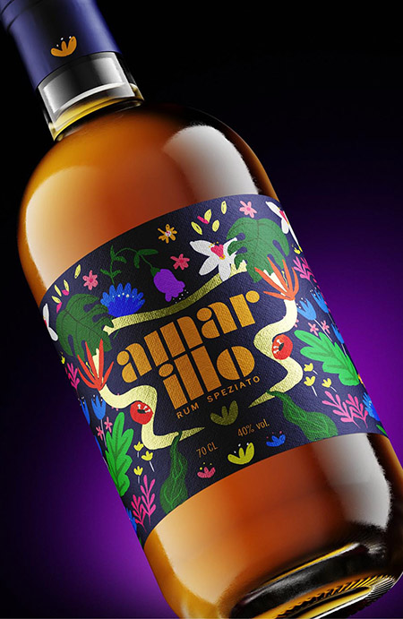
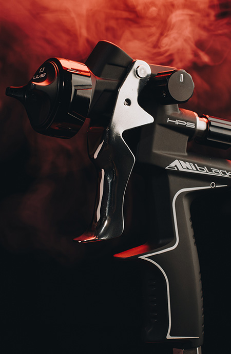
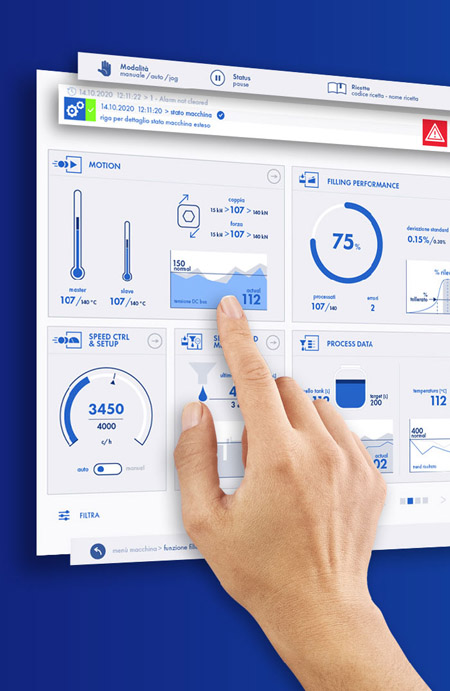
PROJECT HIGHLIGHTS

OUR
CORE
CIAO!
our journey
Siamo in viaggio dal 1987. Un viaggio lungo, intenso, niente meno di quello di Ulisse (con meno sirene, ma più briefing). La nostra Itaca? Non è un punto d’arrivo, è il movimento stesso: restare in cammino, evolvere, cambiare rotta quando serve — senza mai perdere di vista la direzione.
In questi anni di lavoro abbiamo cambiato strumenti, linguaggi, tecnologie. Ma la visione è rimasta la stessa: comunicare in modo intelligente, onesto e visivamente potente.
E non ci siamo ancora stancati di solcare le onde.
V-WORDS
our space
Potremmo dire che siamo i leader sul mercato .
Potremmo dire che la nostra comunicazione è oltre la comunicazione.
Potremmo dire che le nostre soluzioni sono su misura.
Potremmo usare un’altra frase-fuffa, che vuole impressionare, senza dire realmente niente.
MA NON È QUESTO QUELLO CHE SIAMO.
E allora cosa siamo?