01.09.2021 > news and events
Visual (r)evolution
IN THE HEAD OF OUR COMMUNICATION AGENCY
TAGS: BRANDING /
GRAPHIC DESIGN /
COMPANY PROFILE
GRAPHIC DESIGN /
COMPANY PROFILE
Getting into people's heads can be an interesting and at the same time hectic experience, especially if we talk about the head of a creative, and even more if we talk about the creatives in our advertising agency. We made an effort to tell you a little about what has been happening in the past few months.
Even the best ones need to renew themselves, and at Visualcom we know it very well. In over 35 years as a communication agency we have updated and improved our identity more or less every decade: to keep up with the ever-changing times and the newfound technologies that are being born, to celebrate the profound transformations that take place in the company’s structure, and also because we like it and we have a lot of fun while doing it.
The spirit of rebirth has never changed but this time we felt the need for something more, something shocking, for those who know us and for those who will get to know us. A revolution to shake off all the difficulties of 2020, and to find the strength to invest in ourselves and in the Vision of the future that we have in mind for the agency.
In this context, the Visual (r)evolution was born, the company’s evolution and growth program, which is also reflected in the change of the company name, from Visual Comunicazione to Visualcom, and in the consequent rebranding and the new visual identity project.
When we approached the logo design, we had a thousand ideas and we wanted to say even more things. Finding the right path was not easy, we didn’t lack any madness and holes in the water, but finally we can say that there is a bit of each of us in the result, and we are proud of it.
From the beginning we aimed at finding a symbol, an evocative metaphor, which could blend in with the previous logo and with the tradition and experience it represents. We looked for inspiration everywhere, we went out (even of the box), we photographed and scribbled until the enlightenment came. Finally, we found something that could represent the positive meanings we were looking for: the creation of something new, the construction from the foundation, a (new) beginning. And it was something we have right before our eyes every day: the exposed bricks that support and decorate our offices.
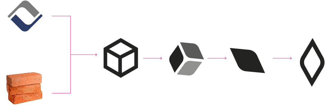
At that point the revelation of the isometric cube was easy. We liked the concept of different sides putting together a solid form, but it was still not enough, we had to look further...
We wanted to preserve the idea of "a set of elements": a group of people and relationships that creates teamwork, but also the union of communication tools that gives shape to a winning strategy. But the symbol was still too complex.
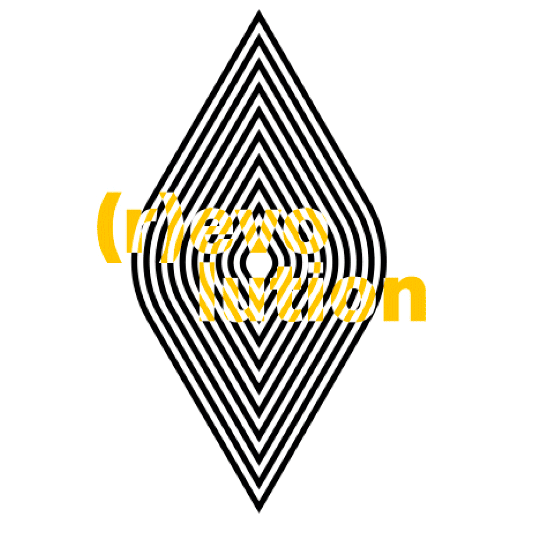
So, we refined the symbol more and more towards an element that would portray a unique vision, a connected space. We then discovered, that the more we simplified the symbol, preserving a more solid and decisive form, the more the concepts that inspired us expanded. One of us saw an eye or a gunpoint, the other a camera focus or a meditation symbol, and the third the link of a chain or a diamond. The potential was infinite and we told ourselves that this way the symbol actually transmits who we are.
At that point, all that remained was to create the entire visual identity: a system that would visually transmit the decades of agency experience with a more modern vision, that would share a story made of visual and narrative suggestions. So, we were inspired by the world of art, combining black and white elements inspired by Op art, with splashes of color derived from Pop art. Elegant, but with a touch of madness.
All the elements that characterize the language of Visualcom evolve from this system, from patterns and optical effects made from the symbol, to duotone or halftone images that would tell about a project or a moment. Each piece contributes to creating a unique vocabulary that communicates the personality and identity of the agency.
This is how Visualcom was re-born and the new slogan "It takes a vision" was born: with the perspective that has characterized the company since 1987, with a renewed and international approach, with a Vision, essential to offer even more global and incisive services, and with a visual system capable of transmitting the character of the company without overpowering what we are most proud of: the work we do for our customers.
This trip in Visualcom’s mind, but also a bit in its heart, ends here. We hope you enjoyed it enough to write us to let us know it, and to read the next articles on our working method.
Follow all Visualcom updates on our Diary, on social media channels and subscribe to our newsletter.
Do you have any questions regarding communication or marketing? Write us about your doubts and we will answer you.