01.09.2021 > news and events

Exhibition design

NOT BOXES, BUT EPHEMERAL ARCHITECTURES

TAGS: BRANDING /
GRAPHIC DESIGN /
COMPANY PROFILE

Often the approach of any graphic designer (yes, the same one of the other articles: the creative guy with the head in the clouds and tattooed arms) to exhibition design is the same as if he was dealing with a gigantic packaging: a supersized box to decorate, if not to fill with content and cool graphics.

This kind of approach can surely lead to an appealing and effective result on a local level; although for sure it doesn’t take into account of all the aspects that an exhibition project has to include. It lacks, in short, of a global vision.

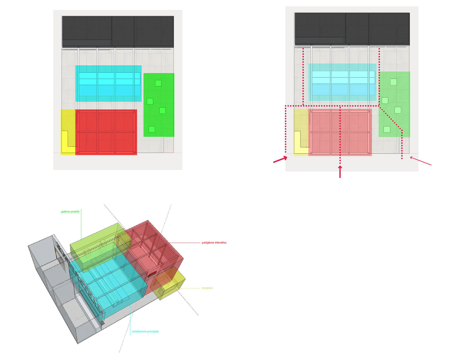
When it comes to exhibition design, not only the graphics on the walls are communicating, but ALL the booth is communicating: the space itself can foster values and enforce therefore the brand identity, not to mention all the surrounding aspects such as lighting, styling and the positioning of the elements that can strongly condition the perception.
Once all the technical details are checked, and once understood all the limits and specifics influencing the design, the first aspect to take into account is neither graphic design, nor the planimetric layout. The first thing to do is defining a coherent and possibly striking exhibition concept, that would allow the visitor to be engaged into an unitarian experience and not into a space with a constellation of unconnected elements. There are many possible ways to go. Which one to choose depends largely on the Tone of Voice of the brand.

The thing that must always be kept in mind is that the exhibition concept must emphasize the objects on display, but also be calibrated in such a way as to strengthen the brand identity, without crushing it (if the installation is too “overbearing” compared to the brand identity) or dilute it (if vice versa the concept is too weak).

Once the spirit of the design, the general mood and the general impact of the experience of the visitor are defined, it’s time to concentrate on transferring and translating this concept into all the exhibition design elements.
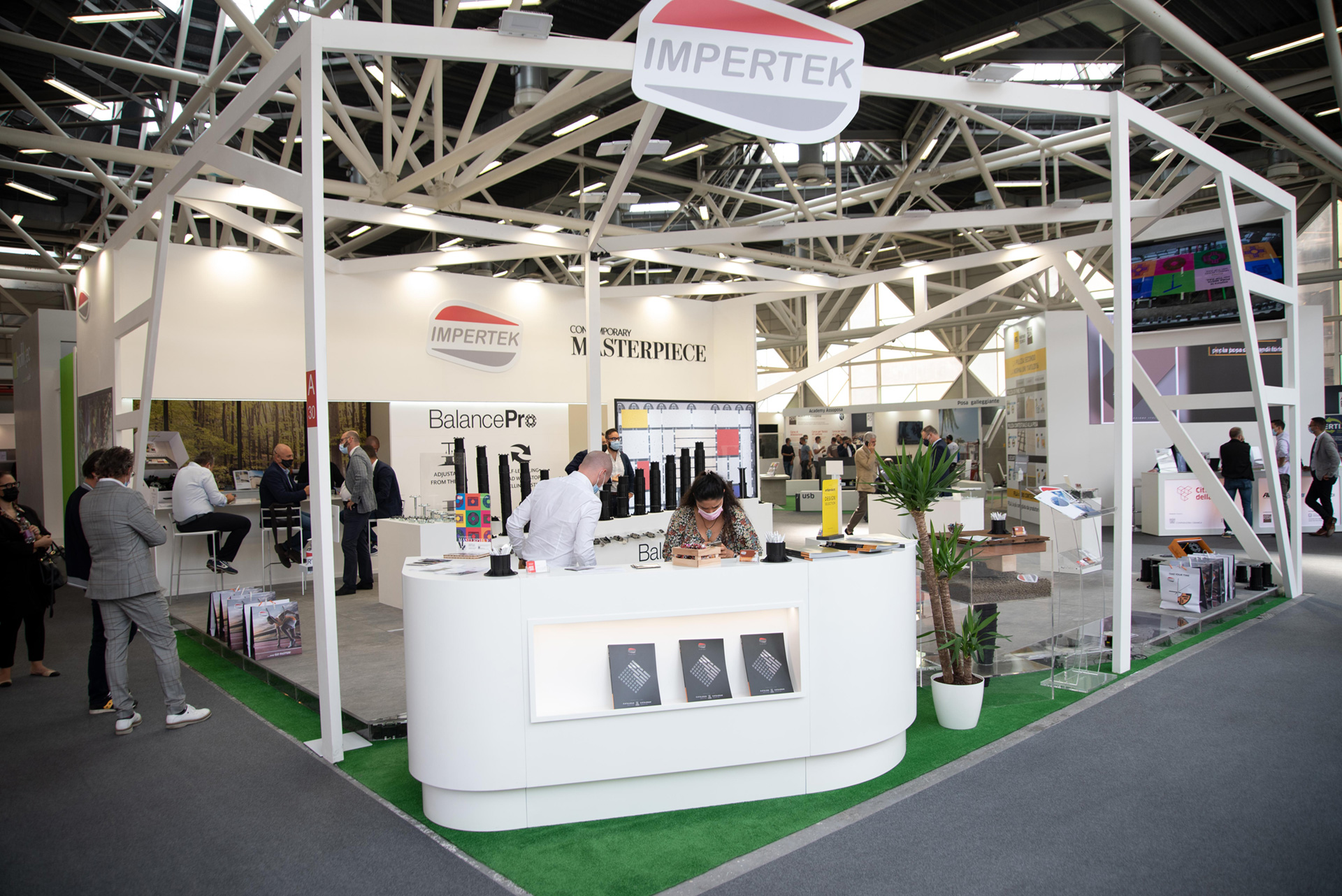
First, we need to focus on paths and flows: from which side does the majority of the visitors come from, what is the order that we want the visitor to follow; do we want to have a continuous flow or a flow interrupted by many different episodes that break the continuity of the visit? This process guides us to positioning all the necessary spaces into the layout, initially roughing them out by macro-areas: we will need a reception, a storage room (how big?) a meeting room (closed, open/semi-permeable?).
Once the areas are identified, the real work starts. The areas simply marked with different colours and nametags have to become usable spaces. This is the moment when all the rules imposed by the technical regulation, the studies of the flows (with an eye on accessibility), the definition of areas, the exhibition concept and the client needs have to merge into a project that holds them together, while preserving the strength of the design, consistently with the communication goals set upstream.

What about graphic design?

Graphic design, or rather visual communication, comes into play in two moments: at the beginning and at the end of the process. At the beginning, in the definition of the exhibition concept which defines -broadly speaking- how important will be graphics in the stand: are graphics going to play a main role (to create for example an immersive experience) or are they going to be minimal? Maybe are there some essential graphics that must be embedded in the design?

At the end of the process, the graphic elements are defined in detail, just before or parallelly to the definition of the architectural details.

Some other fundamental and often forgotten elements are lighting and styling.

Light in particular is greatly affecting how not only spaces are perceived, but also how the displayed objects are valued. Light can be used in a punctual, directional, spot or dim way in order to create some emphatic effects on a section of the stand or on a product; or vice versa it can be used in a diffused way.

Depending on the product category on display, it may be necessary to adequately calibrate the temperature of lights and the luminous flux of the lighting fixtures. In food fairs, generally speaking, there is a tendency to prefer warm lights (cold lights tend to give to the food an uninviting tone); jewellery needs lights with specific temperatures to maximize the colours and brilliance of the gems.
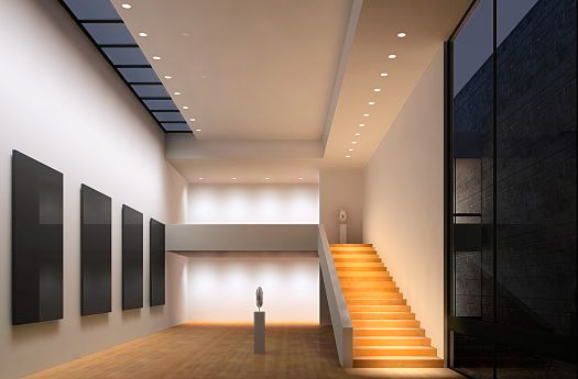
DIFFUSED LIGHT
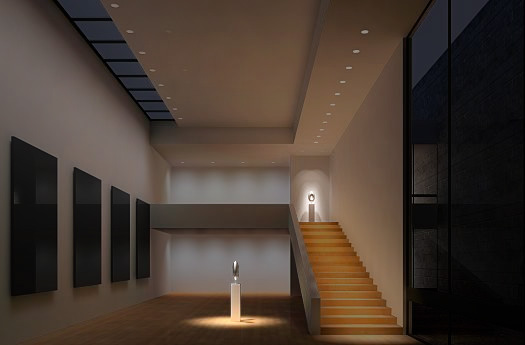
SPOT LIGHT
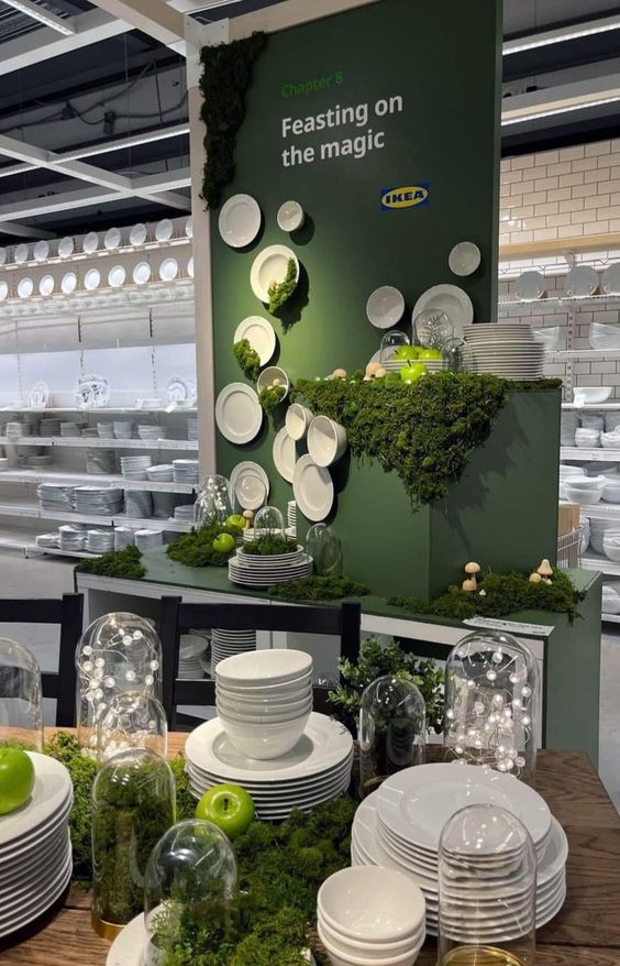
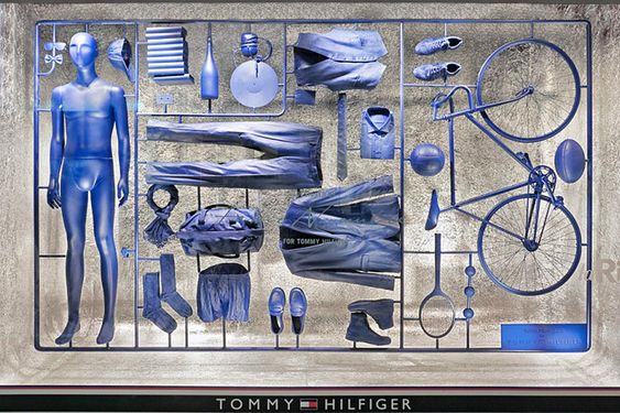
Styling is a very important factor, specially in some sectors such has the furniture and design industry. Here all decorations (may be plants, ornaments, props, books, magazines) integrate into the setting, giving a great contribution in the creation of the right atmosphere of the exhibition: if the concept is based on a welcoming mood, styling could be based on everyday objects; if the concept involves some sort of suspension of reality, bizarre items or unconventionally positioned objects might be the right choice.
If all elements, including the distribution of spaces and positioning of objects, lighting design, styling, graphics, are coherently articulated under a single overall vision expressed by the concept, then all the elements will work as a choir in which different voices sing a single song (that is the communicative message that the stand wants to convey). If instead each of these elements operate in a non-organic way, we will have a collection of beautiful voices that sing slightly different songs.
Discover our Exhibition Design projects.

Follow all Visualcom updates on our Diary, on social channels and subscribe to our newsletter.

Do you have any question related to communication or marketing that you would like to answer? Write us your doubts and we will be happy to get back to you.